
When Figma takes over Sketch
Context
Sketch has been my main design tool for the last couple of years now and I have developed a solid workflow working on a all sorts of projects with it.
Figma seemed to have won the design software market among many web professionals since then, and it was on my radar to join the wagon.
I already had the opportunity to put my hands on it across different small projects and have been quite convinced by the overall interface, and some features that represent an evolution compared to what Sketch has to offer.
I'm currently working on a massive migration work of a design system from Sketch to Figma.
These few weeks would have me definitely convinced by Figma.
Features I liked
Here, I just wanted to compare similar features I considered the most game-changers between Sketch and Figma:
1. Components variants and properties
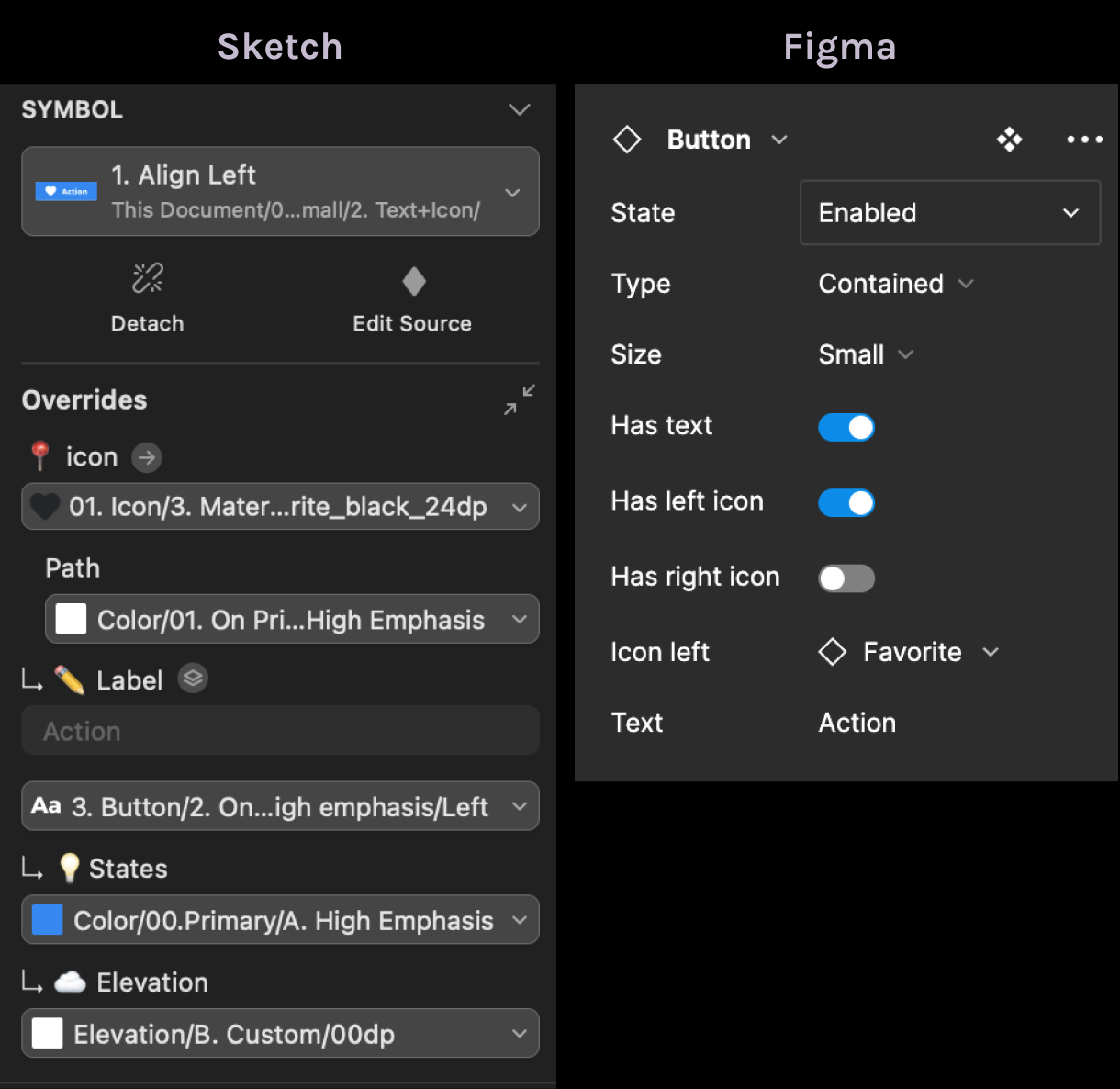
To my opinion, Sketch "overrides" feature is a real mess.
Every swapable property shows up by default in the component instance panel. Of course, we can clean up to prevent every field to appear but I prefer by far the Figma component properties and variants that acts the same.
Also, we don't get an infinite list of stacked properties for nested components.
2. Collaborative and cross-platform oriented
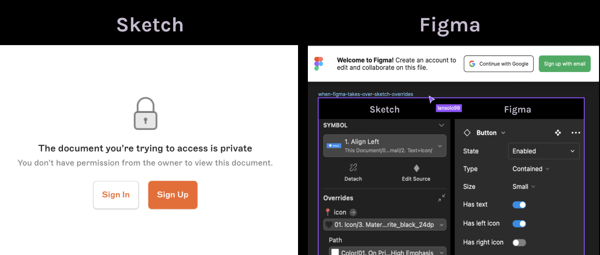
Both have their cloud plateform. Above is the screen you get when someone shares a project's url with you (being a licensed user or not) :
- Sketch deny the access, (you have to subscribe and therefore pay a licence to be able to edit the file)
- Figma open the access (edition is possible even for users having free plan)
I think this is THE reason why Figma has gained massive adoption:
- It's not bound to mac users designers for edition
- It's not locked to subscribed users at the least
Collaboration feature is at the heart of the Figma's philosophy and it eases a lot!
3. Auto layouts vs smart layouts
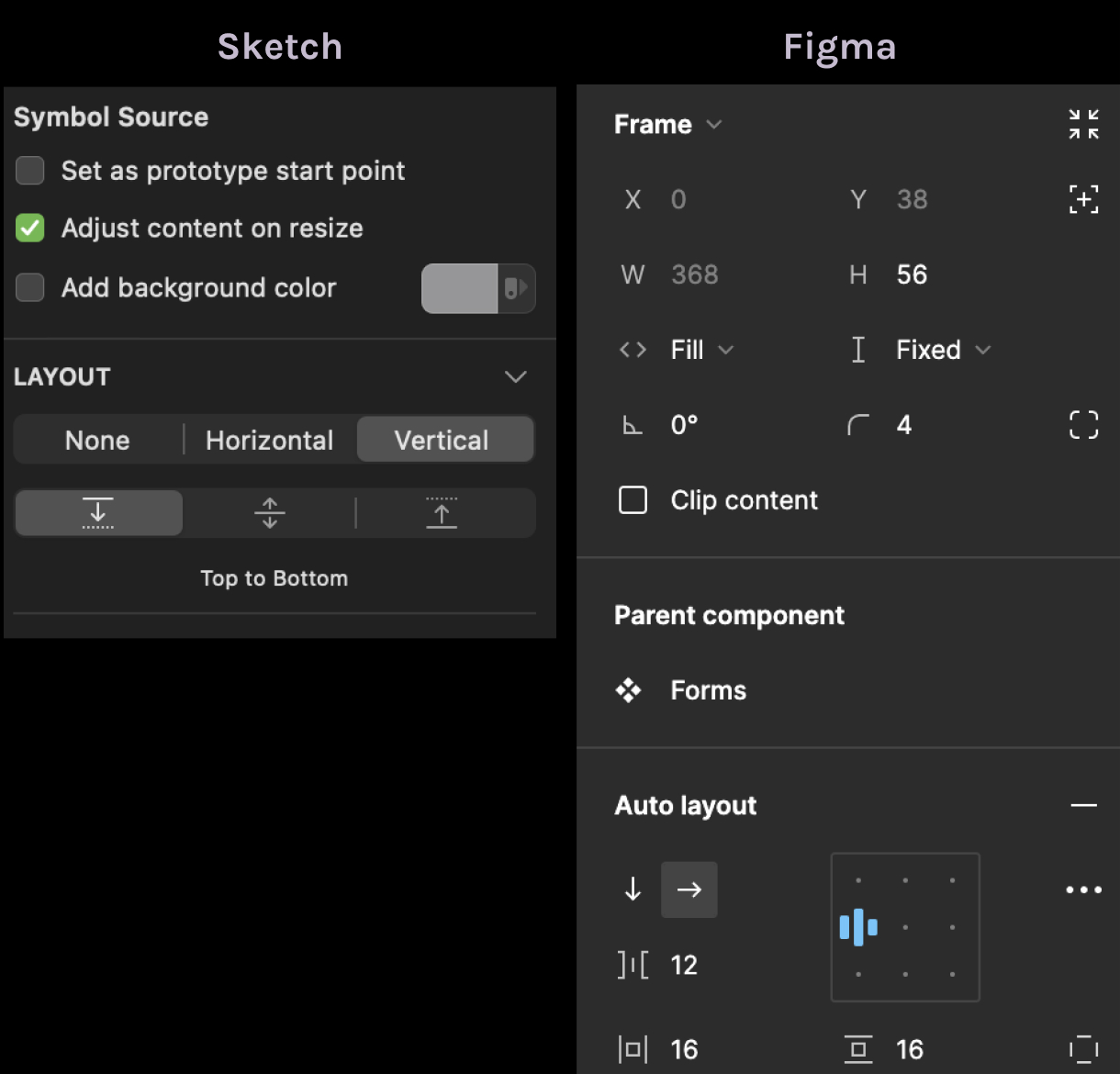
Dealing with controlled layout is an important part when delivering a design efficiently. It mimics the CSS flexbox and grid arrangements.
Sketch has "smart layouts", elements pinning and the tidy feature. We have to use all this in combination to reproduce some kind of CSS arrangements.
Figma has "auto-layouts" and sizing options, which is way more precise and better designed to my opinion.
We can nest auto-layouts and define proper "container paddings" so that we can have our design closely built with a real implementation.
4. Image cropping and frame-based design
The "Frame" element is the base for almost everything in Figma.
Combined with auto-layouts, it acts as a real container with a foreseenable behavior.
Unlike Sketch, we don't need to think of wrapper elements in Figma, we just bring a stack to any selected element and voila.
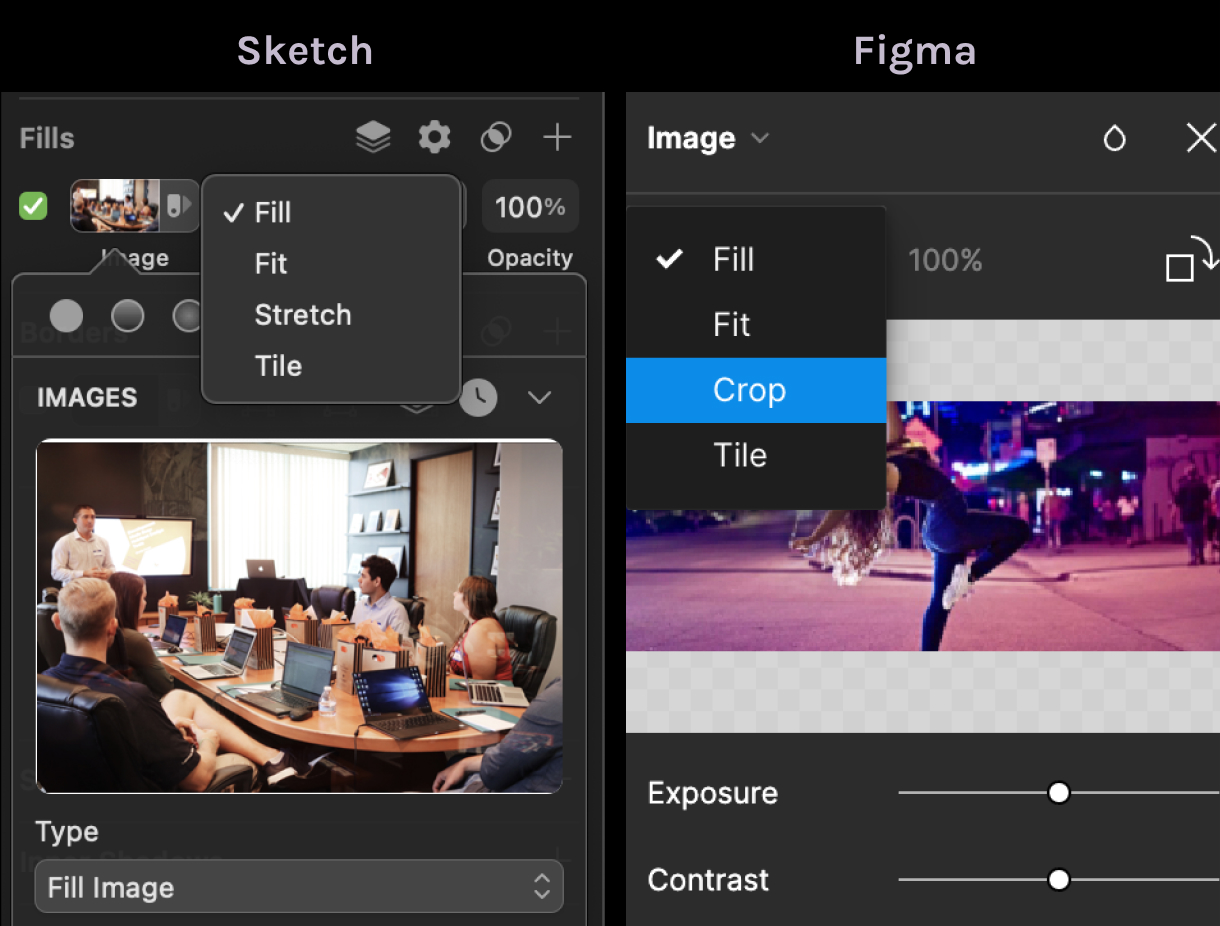
One of the very common use-case is having an image wrapper that serve as a mask, so that we can adjust how an image will be sized and cropped.
In Figma, we have a wonderful option to position a cropped background image, so that we don't need a masking wrapper to adjust it.
Wrapping up
This was just some quick thoughts on features that have me sold in favor of Figma.
Of course, my goal was not to spit on Sketch as it remains an excellent software, but some lacking features inevitably downgrade it as not the best tool anymore.
It's therefore not surprising to watch Figma being the most adopted design tool nowadays, thanks to its wises innovations.


