Building a video explainer with After Effects
Back again to motion design!
It's already been a year I wrote a post on my first After Effects skills serious upgrade.
Motion design business demands went into a spike at that time, so I decided to invest some motion design quality learning, beside my focus on front-end development.
It has been rewarding, both mentally and financially 😼.
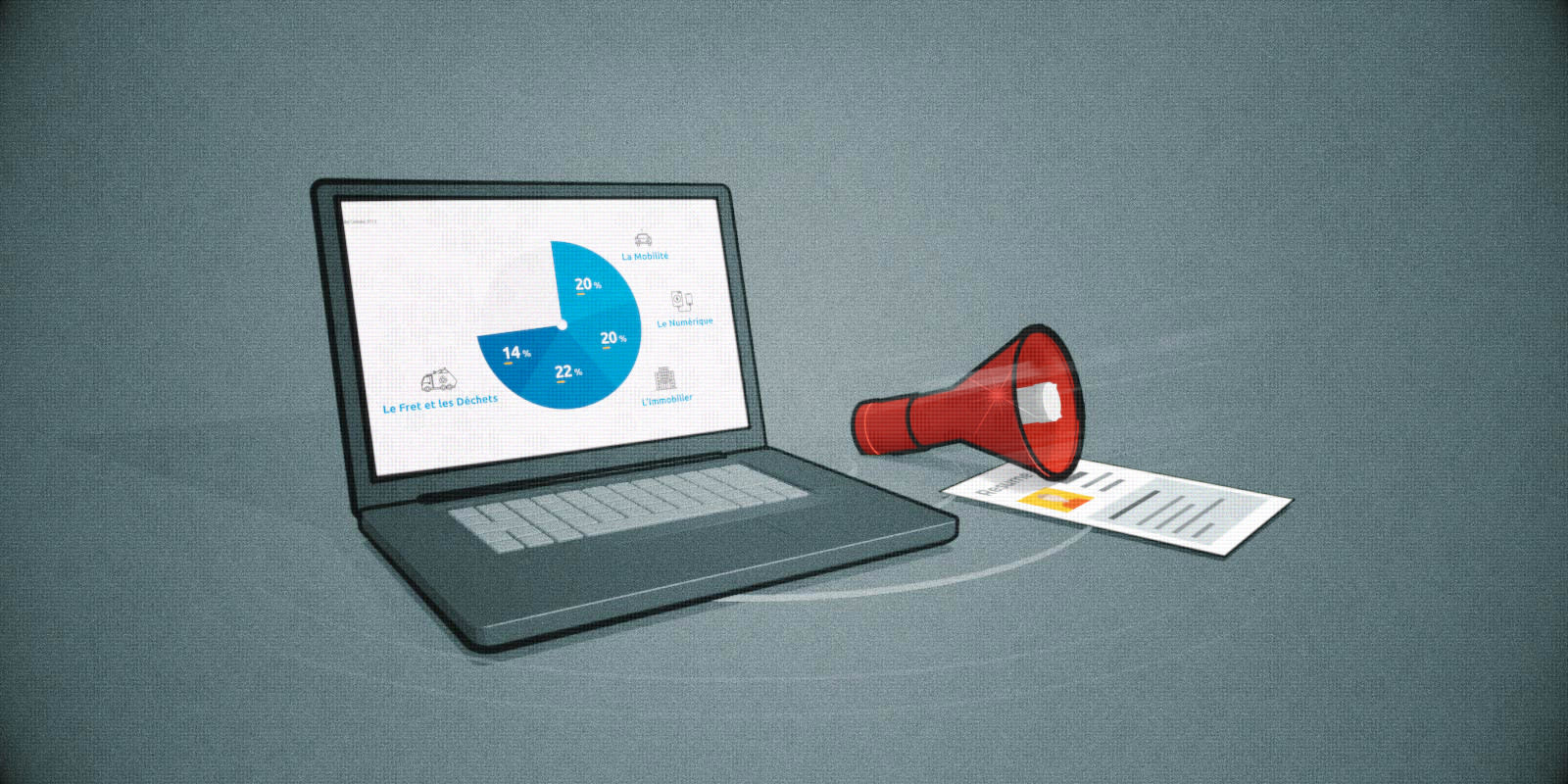
The beginning of 2023 has been the opportunity to realize an explainer video for Banque Populaire, related to the group ecological transition and efforts.
Explainer definition
What differentiates an explainer from other production?
Well, it's adding a voice-over that mostly support what shows up on the screen, instead of texts, and educate people on a topic.
A voice-over needs a bit of planning, because its rythm drives the pace of the video and how elements appear.
Process
I have been given a transcript.
As always, I realized a static storyboard for client's approval.
Generated voice-over
At first, I used this transcript to create an auto-generated voice-over using voicebooking.com.
This service can handle any texts with multiples possible international voices.
I therefore, generated all the needed sentences, and it served me as a support to animate my elements and transitions.
I thought it would be ok, but the client found the result too "robotic" and wanted a real voice, only a few day before the due date 👏.
Real voice-over
We should have hire a pro doing this, but decided to rely on a friend considering the deadline.
I handed-off the final video with subtitles, that adds up to the voice, so that is eased the recording process.
To do so, I used veed.io, which generates subtitles based on a video soundtrack, same as a Youtube algorythm, except you can handle all the display and timing details with high precision.
This friend just passed me by its recording in a single file I just had to drop on the After Effects timeline. Thanks to him!
The result was ok, thought a bit unprofessional in some details (echos, weak voice tone...) but it did the job for the time we had left.
Things I learned
As with every project, I integrated some principles in my workflow, grabbed from different courses that helped me produced a professional look&feel.
Here are some key points :
- Master the rythm and flow to serve the content and keep user engaged : through intention of move, and the 12 Disney principles...
- Be consistent : identify several key effects & stick to the same style throughout the project
- Isolate main parts in pre-comps to ease later editing
- Set sound(s) as animations driver
- Keep things simple, add complexity once the main animation is covered
- Always render half-resolution, using the PRORES 422 preset to handle output file size
- Use and memorize keyboard shortcuts whenever its possible, for all recurrent actions, especially on timeline
Result
Here is the result (french voice-over & subs).
I mostly use some animated icon libraries, considering the limited time I had (10 days).
I think I could have been a lot better if I used some complementary background colors, as well as more transition variations.
I restrict a bit too much regarding consistency, plus, the voice tend to give a "boring" flow.
Wrapping-up
At least, I keep those "mistakes" back in my head, so that I can avoid them for the next motion I'm already working on 🧨
It makes me happy to make progress also as a motion designer, considering video animation is a huge part of the web.
It's not about targeting high-level artpieces, but mastering and delivering common client needs at best!


